In this tutorial, we will embark on an adventure to create a responsive navbar in ReactJS. Responsive design will fit all screen sizes, from large screens to small screens.
Also will ensure that users can effortlessly navigate through the navlinks you build. Buckle up as we delve into the details of responsive design and React magic.
Let’s start creating the navbar on the desktop first then we will make it responsive CSS styles using the media queries.
Create React App
If you already have installed the React app then you can skip this step and continue next to create a navbar in React on desktop screens.
To create a React app, you must have installed Node.js and NPM on your machine. If you already have installed it then open your code editor and terminal. Now run the following command in the terminal.
npm create-react-app my-react-app
If you are getting any errors while installing, please visit the tutorial on how to install reactjs and create an app?
When the project is created, go to the project directory using the cd command following the project directory path.
cd my-react-app
Now you are ready to create a desktop navbar in your ReactJS application and design it as responsive. Let’s get started!
Let’s first create a navbar for the desktop as we normally do on all the websites, like having a brand logo, navigation links, a search icon, promotional buttons, etc.
We will use the React Router’s components to create nav links. Let’s install the React Router package and use it.
Install react-router-dom
To install the react-router-dom package, run the following command in your terminal.
npm i react-router-dom
To create any navbar in reactjs project, it’s better to use the <NavLink> component of the react-router-dom package. It gives us many features to add a router and make the routes work smoothly.
See the following code for creating a navbar using the react-router-dom.
import React from 'react';
import { NavLink } from "react-router-dom";
import { Logo } from '../assets/icons/logo.png';

const Navbar = () => {

	return (
		<>
			<nav>
				<div className="brand-container">
					<NavLink className="brand-logo" href="/">
					  <Logo />
					  YourBlogCoach
					</NavLink>
				</div>
				<div className="navbar-container">
					<ul>
						<li><NavLink to="/">Home</NavLink></li>
						<li><NavLink to="/service">Services</NavLink></li>
						<li><NavLink to="/blog">Blog</NavLink></li>
						<li><NavLink to="/about">About</NavLink></li>
						<li><NavLink to="/contact">Contact</NavLink></li>
					</ul>
				</div>
			</nav>
		</>
	);
}

export default Navbar;
The <NavLink> component provides many props like ‘className‘, ‘style‘, ‘caseSensitive‘, etc. that you can use according to your requirements.
It added the default ‘active‘ class to a <NavLink> component when you are on that page and you can style it to highlight the current active page.
Important Step:
If you are using the <NavLink> component of the react-router-dom package to create a navigation bar in react then It will not work directly. You also have to import the <BrowserRouter> component from it in the main index.js file and wrap the <App /> component in it. See the following example.
import { StrictMode } from "react";
import { createRoot } from "react-dom/client";
import { BrowserRouter } from 'react-router-dom';

import App from "./App";

const rootElement = document.getElementById("root");
const root = createRoot(rootElement);

root.render(
	<StrictMode>
		<BrowserRouter>
			<App />
		</BrowserRouter>
	</StrictMode>
);
This code will make our app like a single-page app and you can smoothly navigate one page to another page without loading the whole page.
Also Read: How to Create Public and Private Routes with React Router?
We have a <Navbar /> component with navigation links, now we will style these links using CSS and make them visually appealing.
body {
margin: 0;
padding: 0;
}
a {
text-decoration: none;
}
header {
background: #227c9d;
}
.container {
max-width: 1180px;
margin: 0 auto;
}
nav {
display: flex;
justify-content: space-between;
}
nav a {
color: #ffffff;
}
.brand-container {
display: flex;
align-items: center;
}
.brand-logo {
display: flex;
align-items: center;
}
.brand-logo img {
margin-right: 5px;
}
.navbar-container {
display: block;
}
.navbar-container ul {
margin: 0;
padding: 0;
}
.navbar-container ul li {
display: inline-block;
}
.navbar-container ul li a {
padding: 20px 15px;
display: block;
}
.navbar-container ul li a.active {
background: #135973;
}
.hamburger-icon {
display: none;
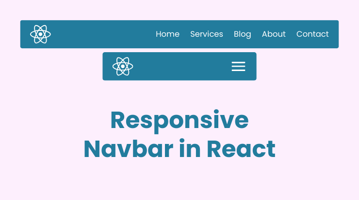
}After adding the above CSS to your App.css file or your custom CSS file, the result will be like the following image.

You can also make a sticky header in React, for more details you can follow the complete tutorial here.
Now we will make a responsive React navbar for mobile devices. We will add some more CSS styles to toggle the hamburger menu icon and show the navigation links.
We will use display: none and display: block properties of CSS to show/hide the menu icon and menus. Let’s see the code.
Add Hamburger Icon
Firstly, add the <Hamburger /> component between the logo and navbar container elements. For this hamburger icon, you can use image or icon libraries like react-icons, react-fontawesome, material-ui, etc.
We will keep this icon hidden for desktops from specific breakpoints and only show it for mobile devices.
<div className="hamburger-icon">
	<Hamburger />
</div>
Let’s add the CSS style for the React responsive navbar. The style will make the icon show/hide and hide the menu wrapper div.
@media (max-width: 600px) {
	.hamburger-icon {
		display: block;
		cursor: pointer;
	}
	nav {
		padding: 20px;
	}
	.navbar-container {
		display: none;
	}
	.navbar-container.mobile {
		position: absolute;
		right: 0;
		top: 74px;
		background-color: #227c9d;
		width: 200px;
		height: calc(100vh - 74px);
		overflow: hidden;
		display: block;
	}
	.navbar-container ul {
		display: flex;
		flex-direction: column;
	}
}
Your React responsive navbar’s design is ready now, you can customize it as you want. You can change the color, font, positioning, etc.
After the final design, we will make a toggle function in the <Navbar /> component to show/hide the navbar when users click on the hamburger icon.
const [showMobileNavbar, setShowMobileNavbar] = useSate(false)

const toggleMobileNavbar = () => {
	setShowMobileNavbar(!showMobileNavbar)
}
<div className="hamburger-icon" onClick={toggleMobileNavbar}>
<Hamburger />
</div>
<div className={`navbar-container ${ showMobileNavbar && 'mobile' }`}>
...
</div>In the above code, we initialize a state variable named showMobileNavbar using the useState hook with a default value is false. The setShowMobileNavbar toggle function is used to update the value of showMobileNavbar. If showMobileNavbar is currently false, it will become true, and vice versa.
Then we define the hamburger icon HTML having an onClick event on toggleMobileNavbar function to toggle the value.
In the next code block, the class name is conditionally modified based on the value of showMobileNavbar. If showMobileNavbar is true, it adds the class ‘mobile‘, resulting in navbar-container mobile. This is a common pattern in React for conditionally applying CSS classes based on the state of a component.
See the following image of the result of the responsive react navbar that works for all mobile devices.
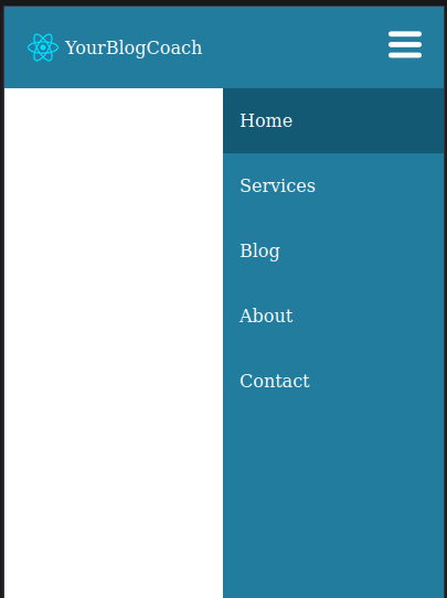
In the above responsive navbar style, we style for a 600px viewport, you can also style for other viewports or a different style for a viewport.
Here is the complete code of the responsive navbar reactjs component and CSS style.
Navbar.jsx
import React, { useState } from 'react';
import { NavLink } from "react-router-dom";
import { Logo } from '../assets/icons/logo.png';
import { Hamburger } from '../assets/icons/hamburger-icon.png';

const Navbar = () => {
	const [showMobileNavbar, setShowMobileNavbar] = useSate(false)

	const toggleMobileNavbar = () => {
		setShowMobileNavbar(!showMobileNavbar)
	}

	return (
		<>
			<nav>
				<div className="brand-container">
					<NavLink className="brand-logo" href="/">
					  <Logo />
					  YourBlogCoach
					</NavLink>
				</div>
				<div className="hamburger-icon" onClick={toggleMobileNavbar}>
					<Hamburger />
				</div>
				<div className={`navbar-container ${ showMobileNavbar && 'mobile' }`}>
					<ul>
						<li><NavLink to="/">Home</NavLink></li>
						<li><NavLink to="/service">Services</NavLink></li>
						<li><NavLink to="/blog">Blog</NavLink></li>
						<li><NavLink to="/about">About</NavLink></li>
						<li><NavLink to="/contact">Contact</NavLink></li>
					</ul>
				</div>
			</nav>
		</>
	);
}

export default Navbar;
App.css
body {
	margin: 0;
	padding: 0;
}
a {
	text-decoration: none;
}
header {
	background: #227c9d;
}
.container {
	max-width: 1180px;
	margin: 0 auto;
}
nav {
	display: flex;
	justify-content: space-between;
}
nav a {
	color: #ffffff;
}
.brand-container {
	display: flex;
	align-items: center;
}
.brand-logo {
	display: flex;
	align-items: center;
}
.brand-logo img {
	margin-right: 5px;
}
.navbar-container {
	display: block;
}
.navbar-container ul {
	margin: 0;
	padding: 0;
}
.navbar-container ul li {
	display: inline-block;
}
.navbar-container ul li a {
	padding: 20px 15px;
	display: block;
}
.navbar-container ul li a.active {
	background: #135973;
}
.hamburger-icon {
	display: none;
}


@media (max-width: 600px) {
	.hamburger-icon {
		display: block;
		cursor: pointer;
	}
	nav {
		padding: 20px;
	}
	.navbar-container {
		display: none;
	}
	.navbar-container.mobile {
		position: absolute;
		right: 0;
		top: 74px;
		background-color: #227c9d;
		width: 200px;
		height: calc(100vh - 74px);
		overflow: hidden;
		display: block;
	}
	.navbar-container ul {
		display: flex;
		flex-direction: column;
	}
}
Related Links
Conclusion
Congratulations, you have gone through and learned about creating a responsive navbar in the ReactJS application. You learned how to create a normal navbar component and then convert it into a responsive one by adding CSS styles.
By combining React’s power, Flexbox’s flexibility, media queries’ adaptability, smooth transitions, and dynamic routing, you’ve crafted a user-friendly experience that scales effortlessly across devices.
FAQs
To make your React navigation bar responsive, utilize Flexbox for a flexible layout. Apply media queries to styles based on screen sizes, ensuring your navigation adapts gracefully.
Flexbox provides a simple and powerful layout model in React, allowing you to create a responsive structure. It enables your navigation bar to adjust its appearance seamlessly across various devices.
Media queries play a very important role in responsive design by allowing you to apply specific styles based on device characteristics. They ensure your navigation bar looks great not only on large screens but also on smaller devices like mobile phones.
CSS transitions bring a touch of elegance to your navigation bar. By adding smooth animations, transitions create a visually appealing experience. Hover effects, like color changes and subtle scaling, can make your navigation more engaging.
React Router enables seamless navigation between different pages in your React application. By incorporating React Router, your navigation bar effortlessly handles dynamic content, providing a smooth and intuitive user experience.


